
Styling your Custom iFrame improves your website’s look and user experience. A well-designed iFrame blends with your site, matches your brand, and enhances readability. Learning to style Custom iFrame helps create a more attractive and seamless design.
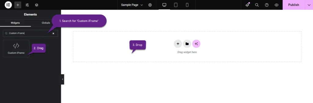
Step 1: Add the Custom iFrame Widget
- Install and Activate Custom iFrame Plugin
- Open your page in Elementor Editor.
- Drag and drop the Custom iFrame Widget onto your page.
Step 2: Adjust the iFrame Content
Paste the URL into the Source URL field, and the content will appear on your page. Customize its look with these options:
- Height: Set a fixed height for your Custom iFrame to control how much space it takes on your webpage. You can set different heights for desktop, tablet, and mobile to ensure the best fit across all devices. Choose a height that maintains content visibility without cutting off important information.
- Auto Height: Enable Auto Height to let the iFrame adjust automatically based on the content inside. This is useful for embedding dynamic content that changes in size.
- Show Scrollbars: Turn scrollbars on or off based on your needs. If the embedded content is larger than the iFrame, enabling scrollbars allows users to scroll through the content. Disable scrollbars for a cleaner look if the content fits well.
- Refresh Interval (Seconds): Set a Refresh Interval to automatically reload the iFrame at a chosen time. This is helpful for displaying live data, news updates, or frequently changing content without requiring users to refresh the page manually.
Step 3: Set up Smart Load

The Smart Load feature helps optimize page performance and improve user experience. It includes the following options:
- Lazy Load: Enable Lazy Load to load the iFrame content only when it becomes visible on the screen. This reduces initial page load time and improves performance, especially for pages with multiple iFrames.
- Placeholder Image: Set a Placeholder Image to display before the iFrame content loads. This keeps the page visually appealing while reducing unnecessary loading of off-screen content.
Step 4: Adjust Styling Options
Go to the Style Menu to style Custom iFrame. Use the available options to match it with your website’s design.
- Padding: Set padding to control the space inside the Custom iFrame. Adjust padding separately for desktop, tablet, and mobile to ensure proper spacing across all devices. Use this to avoid content looking too crowded or too spaced out.
- Alignment Options: Choose from Left, Center, or Right alignment to position the Custom iFrame correctly on your page. Center alignment works best for balanced layouts, while left or right alignment may suit side content areas.
- Container Width: Adjust the Custom iFrame width to fit different screen sizes. Set separate values for desktop, tablet, and mobile to ensure it looks perfect on all devices. A full-width setting works well for immersive content, while a fixed width may be better for structured layouts.
Step 5: Style the Background
There are two types of backgrounds available. Choose one that best suits your website design.
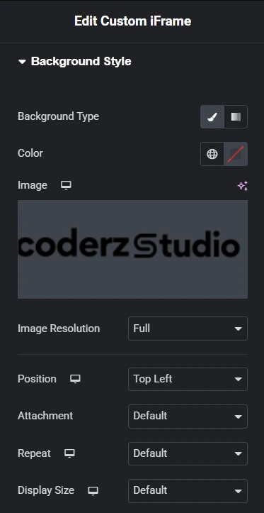
1. Classic Background
If you select Classic, you can customize it using the following options:
- Color: Pick a solid color manually or use global colors.
- Image: Upload an image for a more personalized look.
- Image Resolution: Adjust the quality and size of the background image.
- Position: Set the image alignment within the background.
- Attachment: Choose Default, Scroll, or Fixed to control whether the background moves with scrolling.
- Repeat: Select Default, No-repeat, Repeat, Repeat-X, or Repeat-Y to define how the image tiles.
- Display Size: Choose Default, Auto, Cover, Contain, or Custom. If you choose Custom, you can manually adjust the width for a perfect fit.
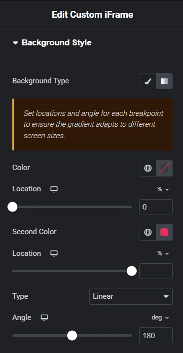
2. Gradient Background
If you select Gradient, the following options will be available:
- Color: Choose the first color manually or select from global colors.
- Location: Adjust where the first color appears in the gradient.
- Second Color: Pick an additional color to create a gradient effect.
- Location: Define where the second color starts blending.
- Type: Select Linear for a straight gradient or Radial for a circular effect.
- Angle: Set the direction of the gradient for smooth color transitions.
Use these background options to enhance your Custom iFrame, ensuring it blends seamlessly with your website’s design.
Step 6: Style the Border
Customize the border of your Custom iFrame to match your website’s design. Use the following options:
- Border Type: Choose from solid, dashed, or dotted styles to define the border’s appearance.
- Border Width: Adjust the thickness of the border to make it subtle or more prominent.
- Border Color: Select a custom color manually or use global colors for consistency.
- Border Radius: Round the edges of the iFrame to create a softer or more modern look.
Experiment with these settings to find the perfect border style that complements your design.

Step 7: Style the Box Shadow

Enhance the look of your Custom iFrame by adding a shadow effect. This helps create depth and makes the iFrame stand out on the page.
- Color: Choose a shadow color manually or from global colors to match your theme.
- Horizontal: Adjust the shadow’s position left or right.
- Vertical: Move the shadow up or down for better placement.
- Blur: Increase or decrease blur to soften or sharpen the shadow.
- Spread: Control how far the shadow extends around the iFrame.
- Position: Choose between an Outline or Inset shadow effect.
Use these settings to create a subtle or bold shadow effect that complements your website’s design.
With the Custom iFrame plugin, you can style and customize embedded content to match your website. Adjust dimensions, borders, backgrounds, and shadows for a seamless look. Use these settings to Style Custom iFrame. And improve user experience and keep your site visually appealing.